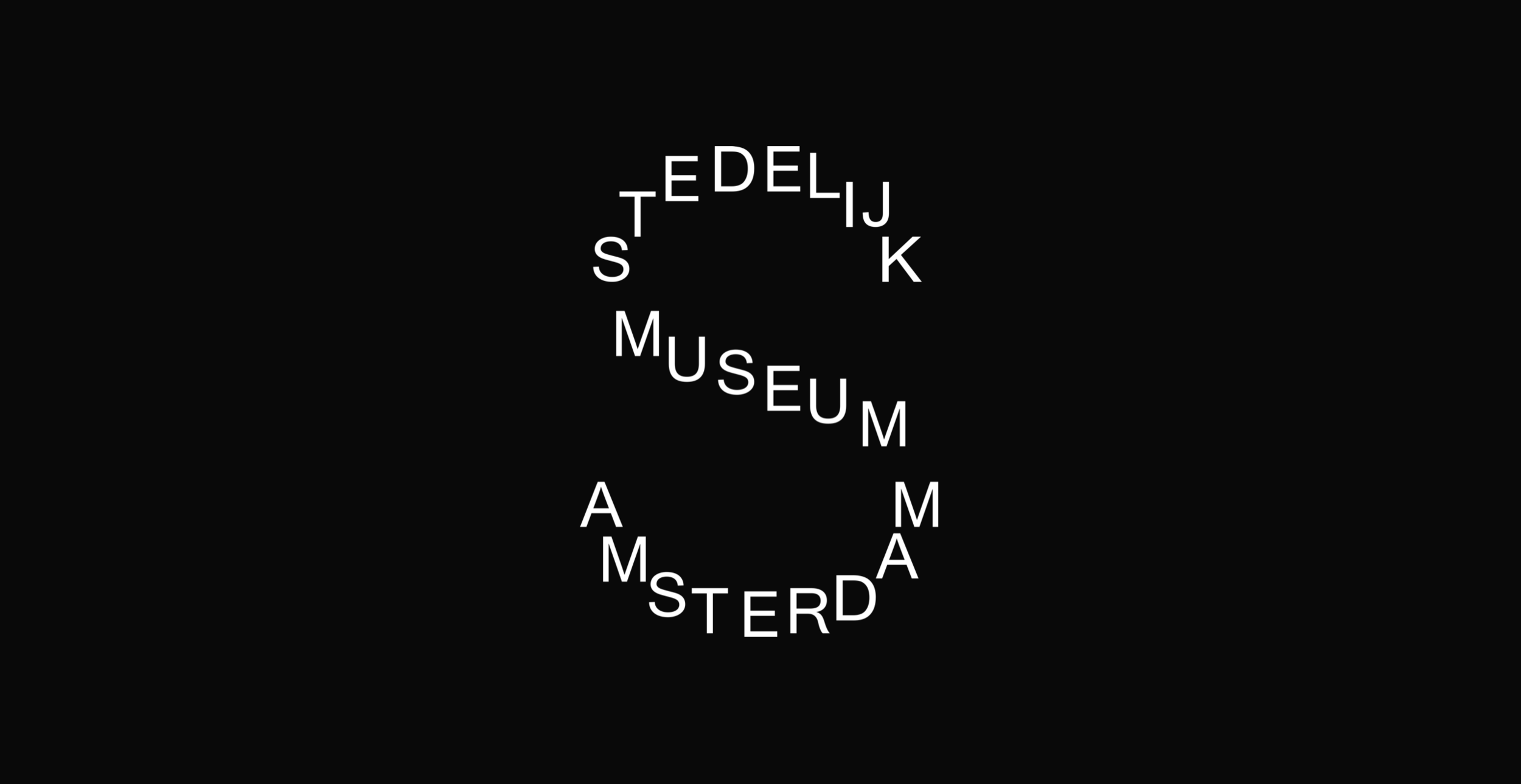
Design should be bold.
Design should be bold.
— Stedelijk Museum Amsterdam website redesign
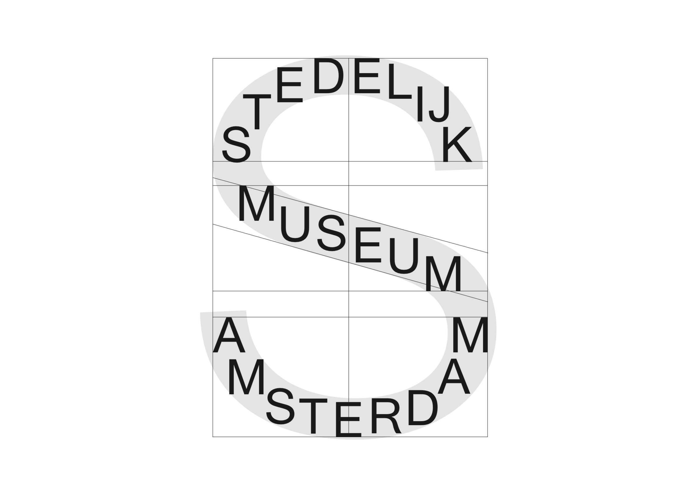
About Stedelijk Museum Amsterdam
The Stedelijk Museum painted its walls white in 1938, becoming the first museum in the world to do so. In retrospect, this introduced the White Cube concept, which is still the standard for museum galleries worldwide. This urge for innovation is characteristic of the Stedelijk.
How do people use digital media?
My role
Prototyping
Design
Design system
Brief
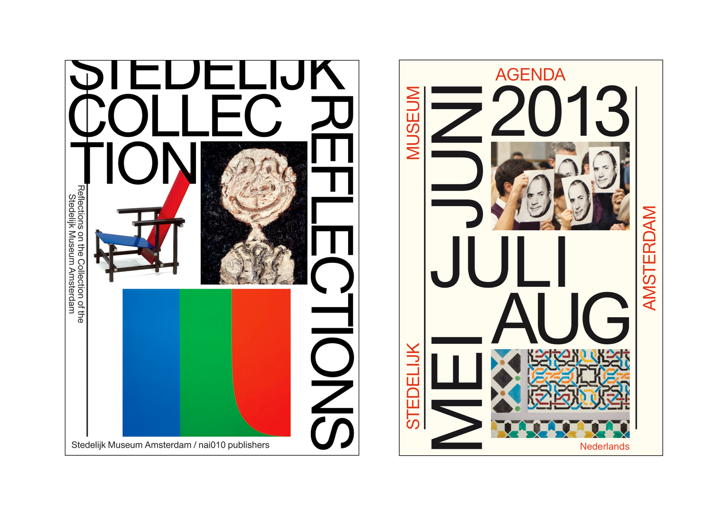
The Stedelijk Museum has an iconic, recognizable identity designed by Mevis & Van Deursen. The challenge was to translate this identity into a digital style without copying the printed forms. The goal was to create a website that fits the character of the Stedelijk, is intuitive, and mobile-first.
Concept
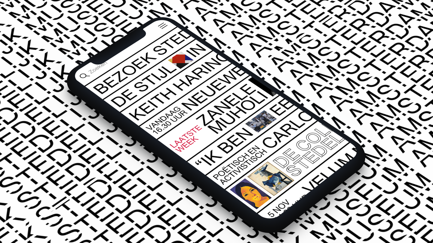
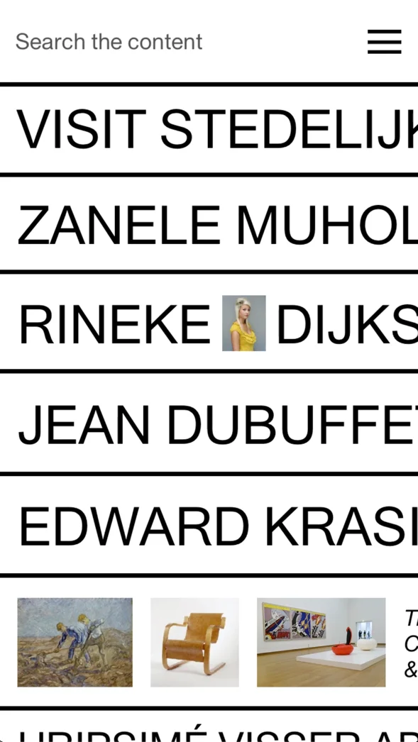
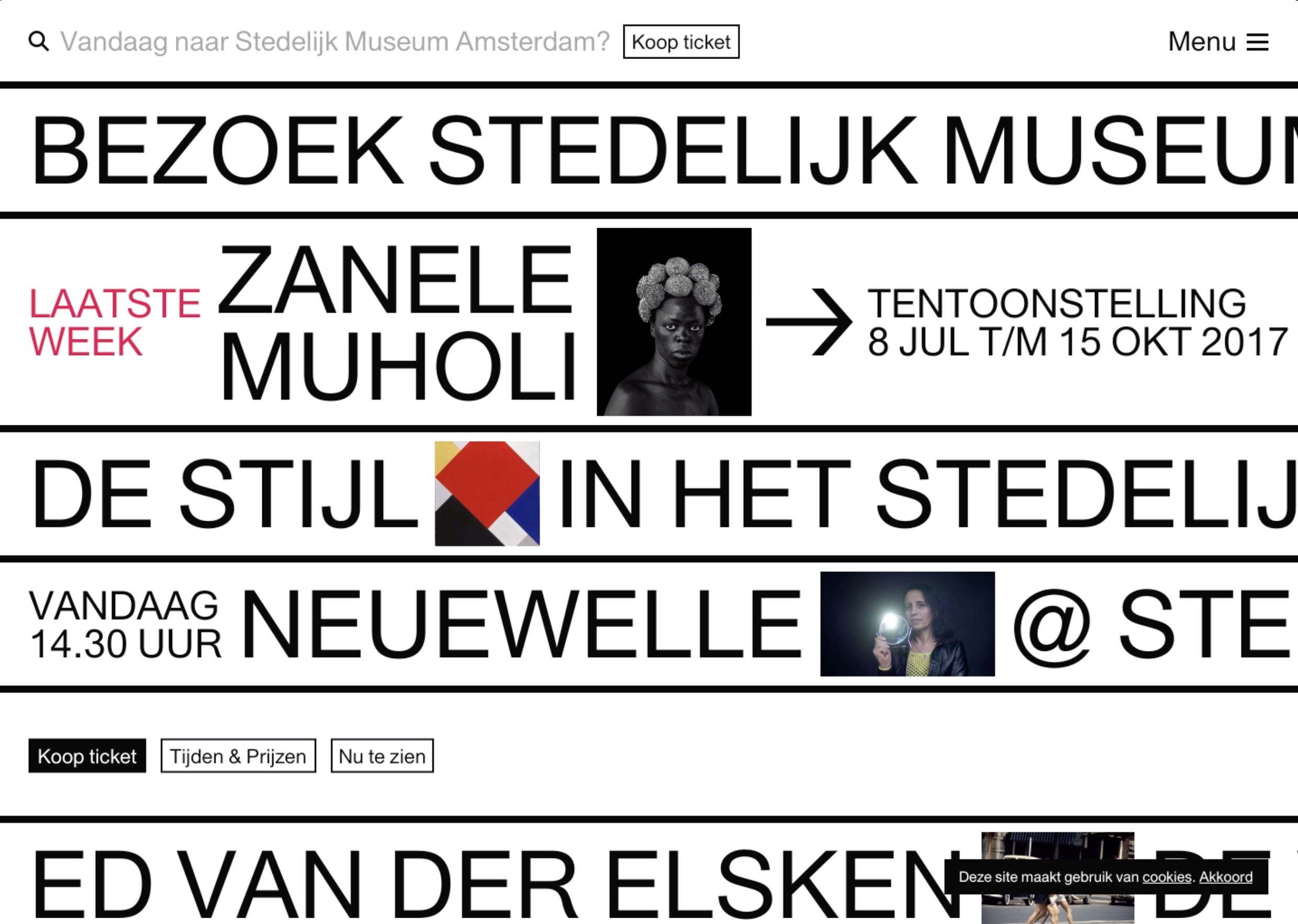
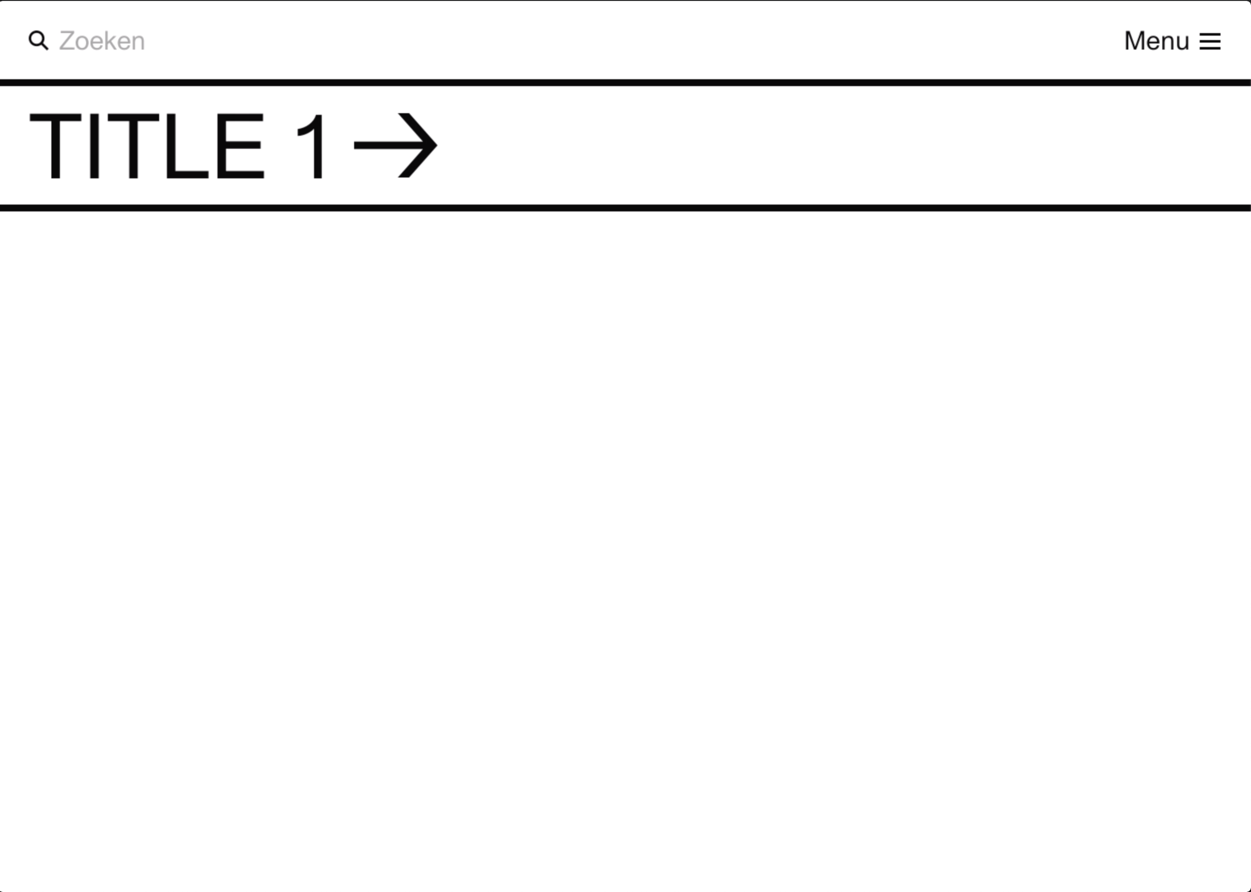
The visual identity of the Stedelijk Museum comes from print. Their old website looked like a poster and felt very flat, but websites should not look like posters. There is much more you can do. In talks with Beatrix Ruf, the former director of the Stedelijk Museum, one question kept coming back: how do we use digital media nowadays? One typical pattern often used in digital media is the list view. The typographic bars you see, for example on the home screen, are inspired by this list view pattern.
Prototyping
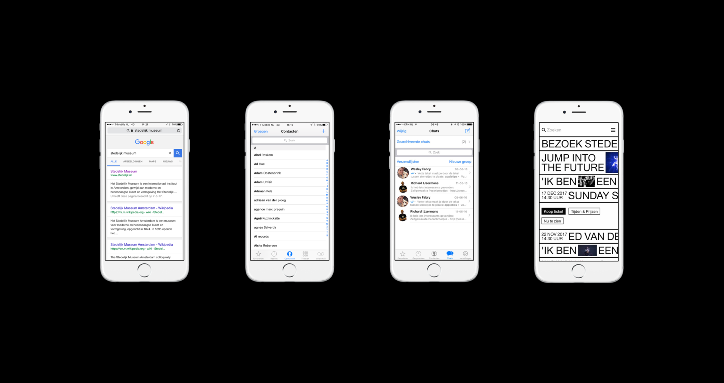
My first project at GRRR was Stedelijk Museum Amsterdam. I started by creating prototypes to test the design. Later, these prototypes were used to test the website with users inside the museum. The challenge was to make it clear that users could drag the bars to read the text. Below are three prototypes in which I try to answer the question: how can you let the user know that the bars scroll?
Design
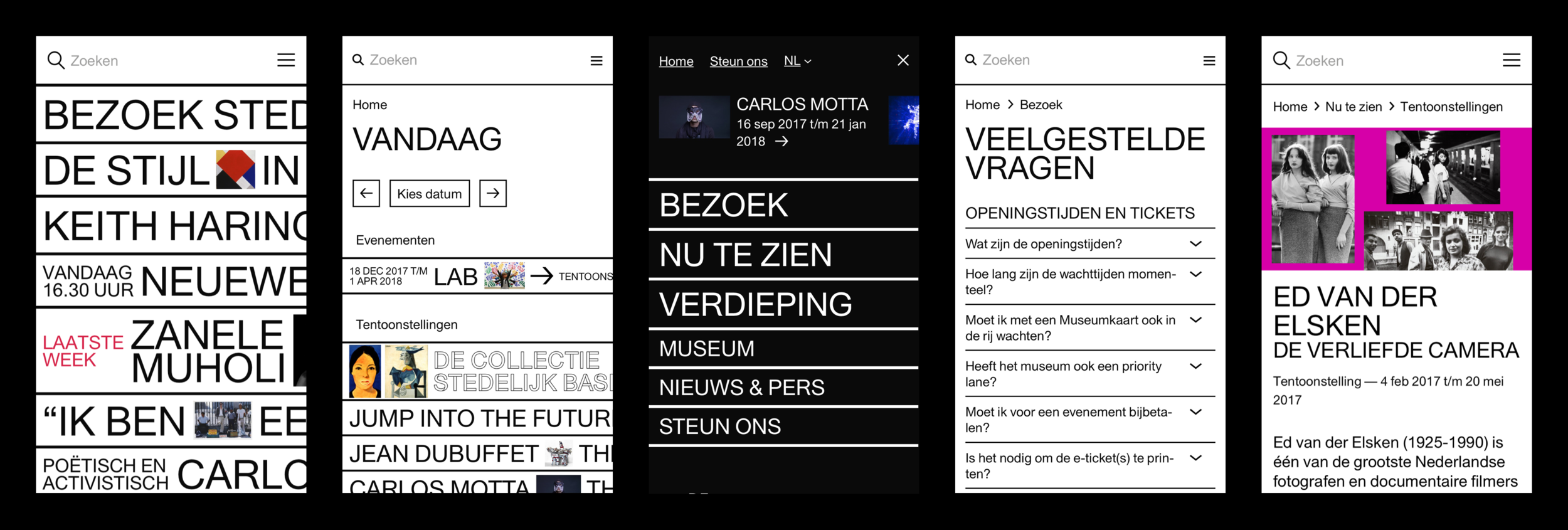
Bas Koopmans created the concept design. My role was to translate the sketches into realistic designs that would work. From there, the challenge was to create a system that could scale across a few thousand pages. I started designing mobile-first and later adapted the designs for desktop. It was exciting to see how the designs behaved on large screens.
The base of all pages was typographic. Based on the typography size, the margins, line width, and bar height were defined.
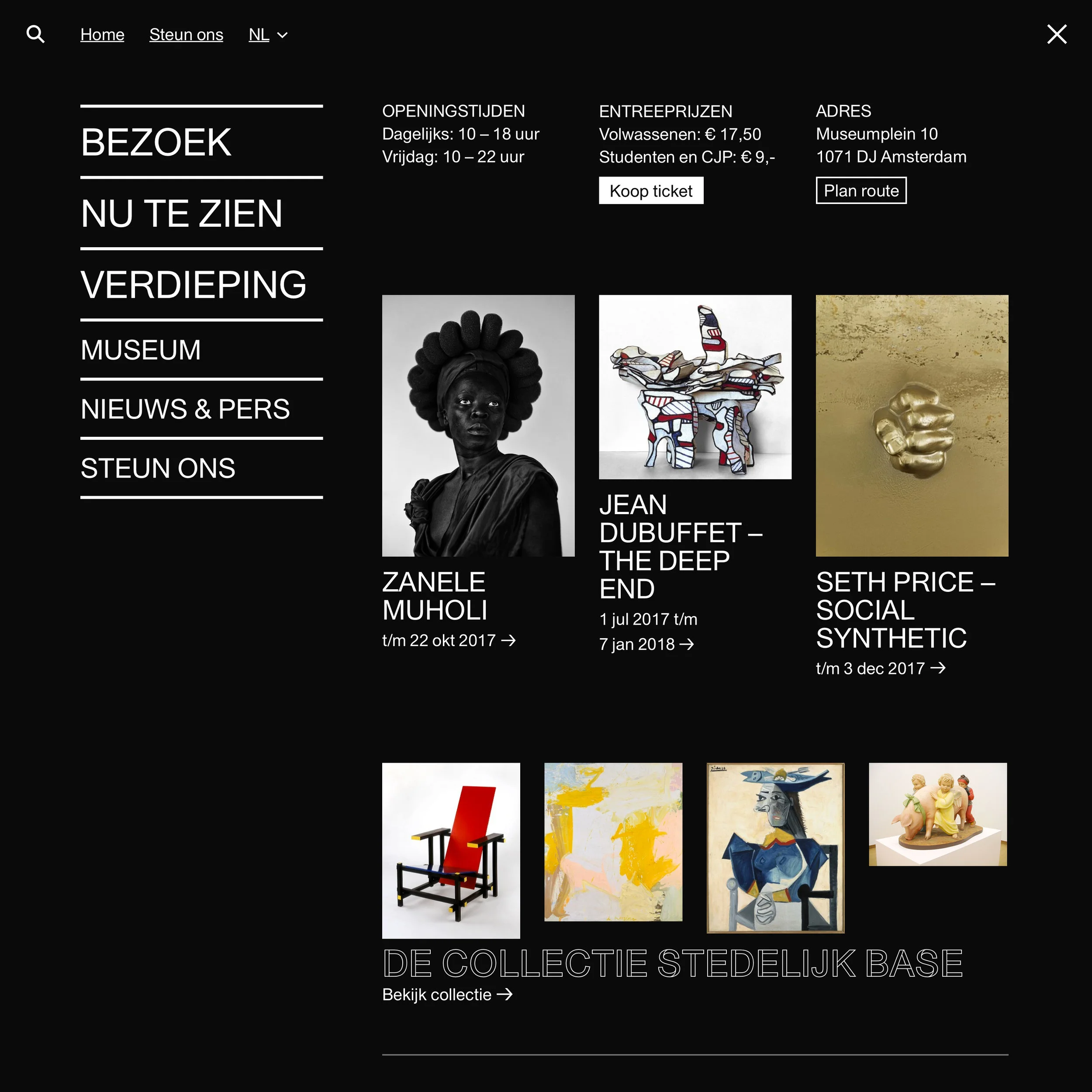
The style of the website is very bold. The animations are hard, as is the contrast. Everything is black and white, with a few exceptions such as placeholder text. The menu uses inverted colors compared to the home screen, making it clear that you are in a different section.
A nice detail: the search engine talks to you. Depending on where you are, you receive tips and reactions.
Design system
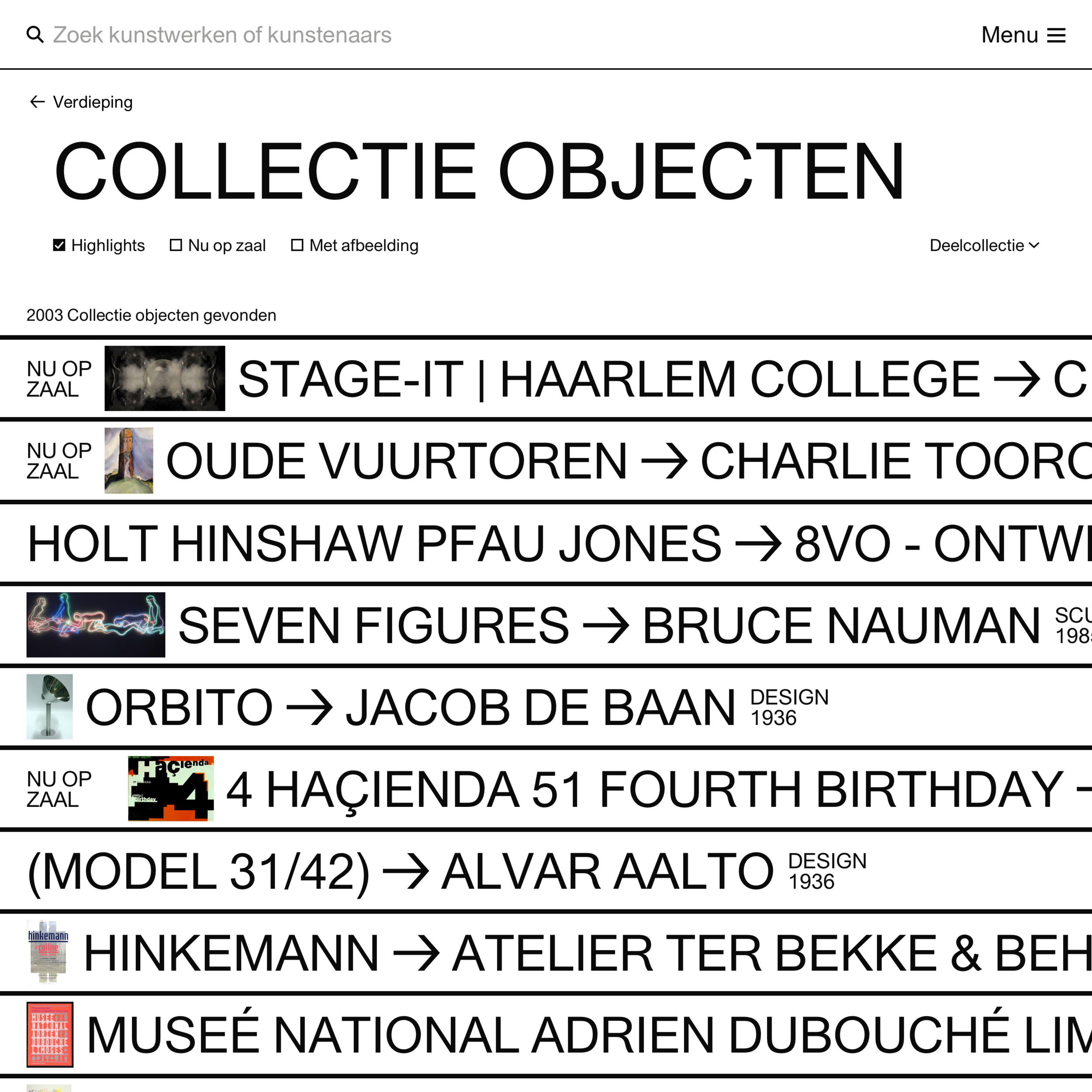
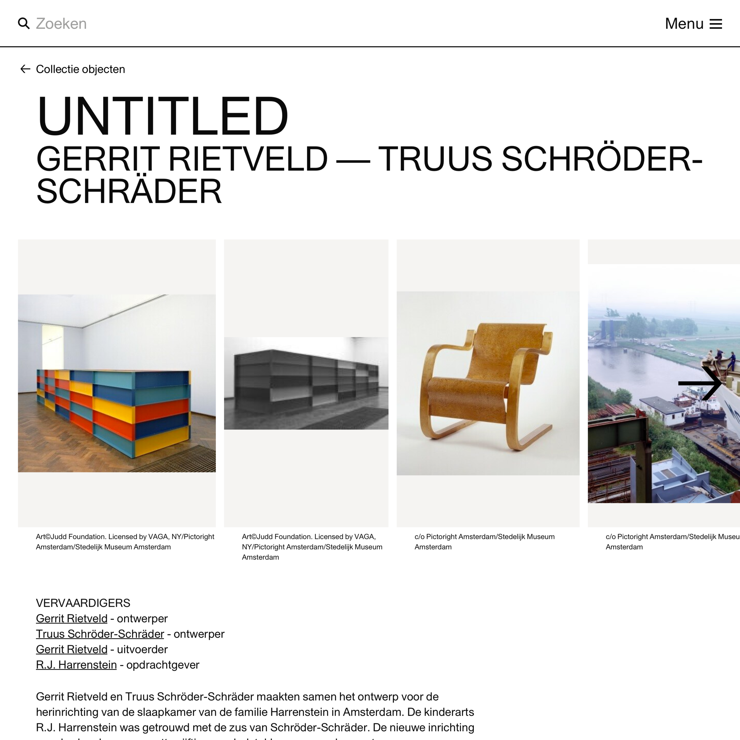
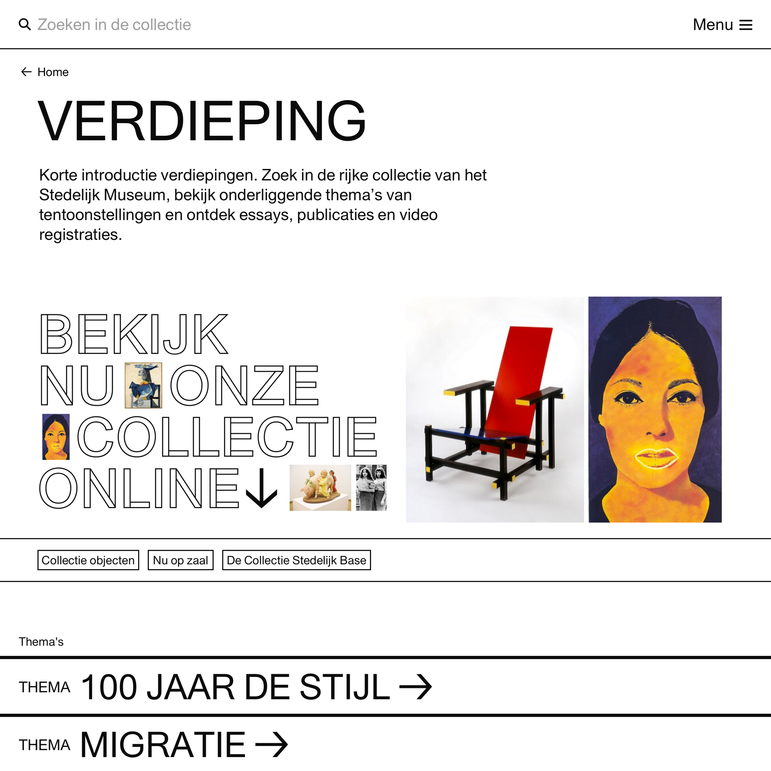
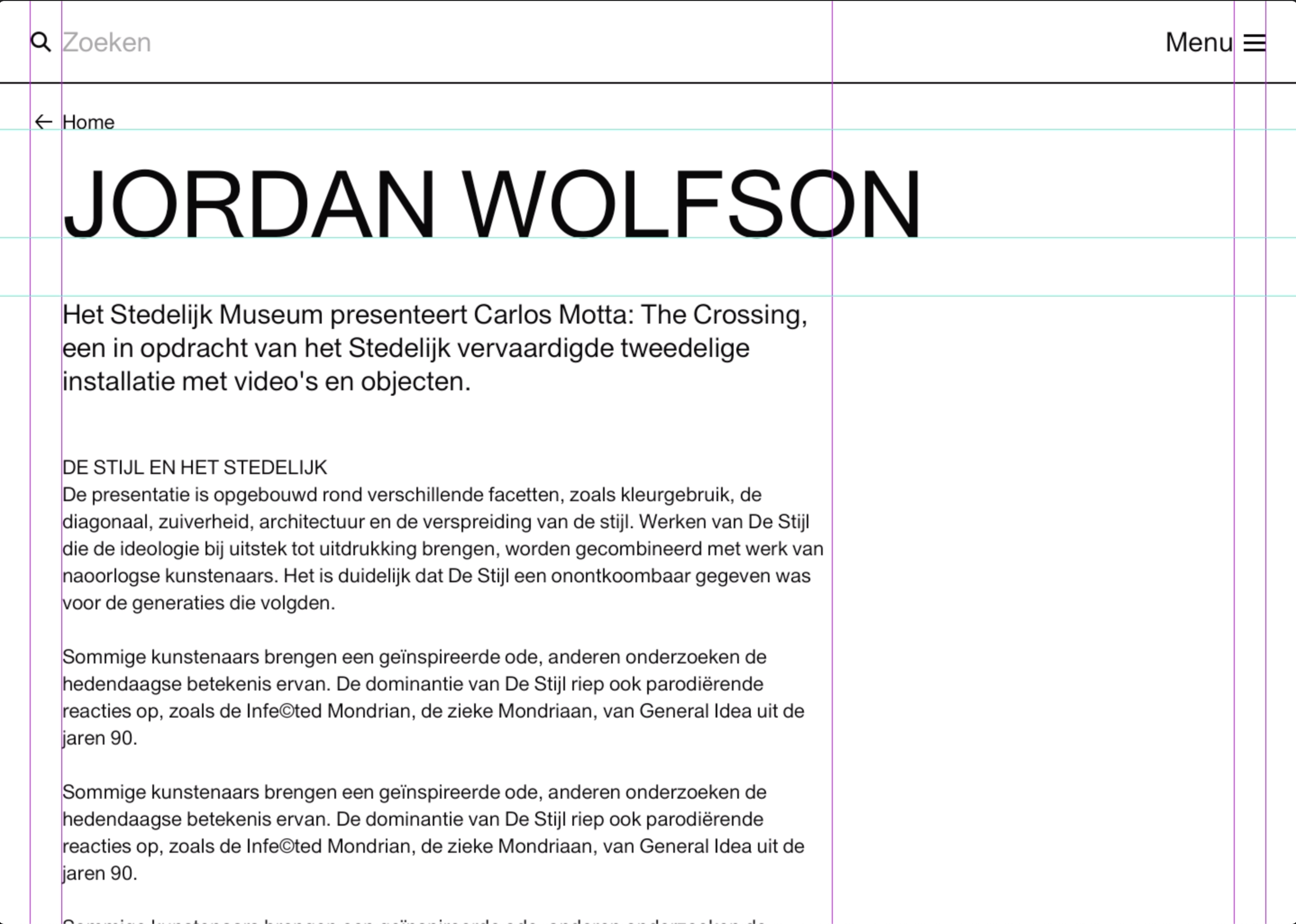
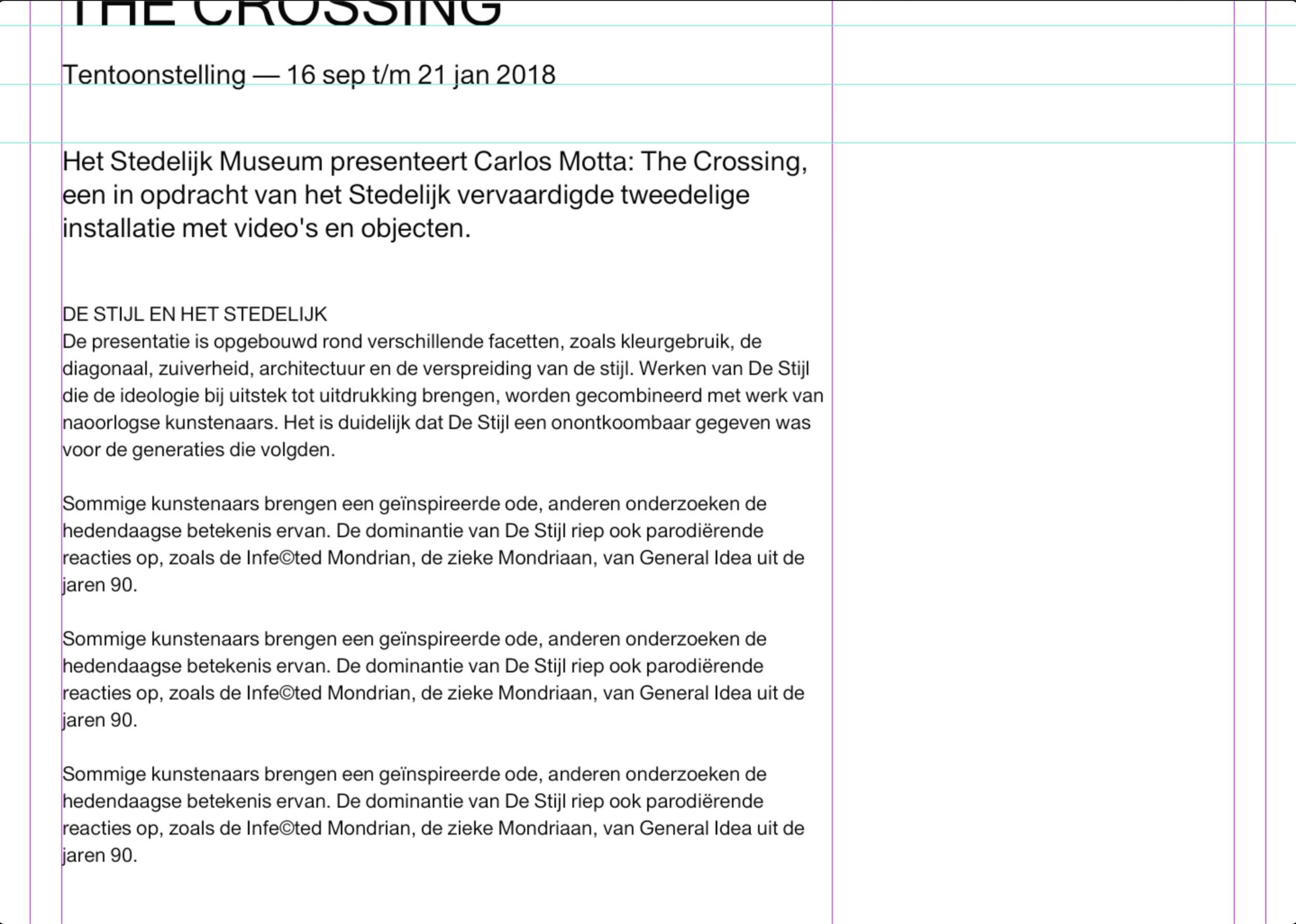
The website consists of two levels: the typographic bars and the content pages. The typographic bars are visible on the main pages that include list views, such as the home page and the agenda. On the second level, the focus is on the information.
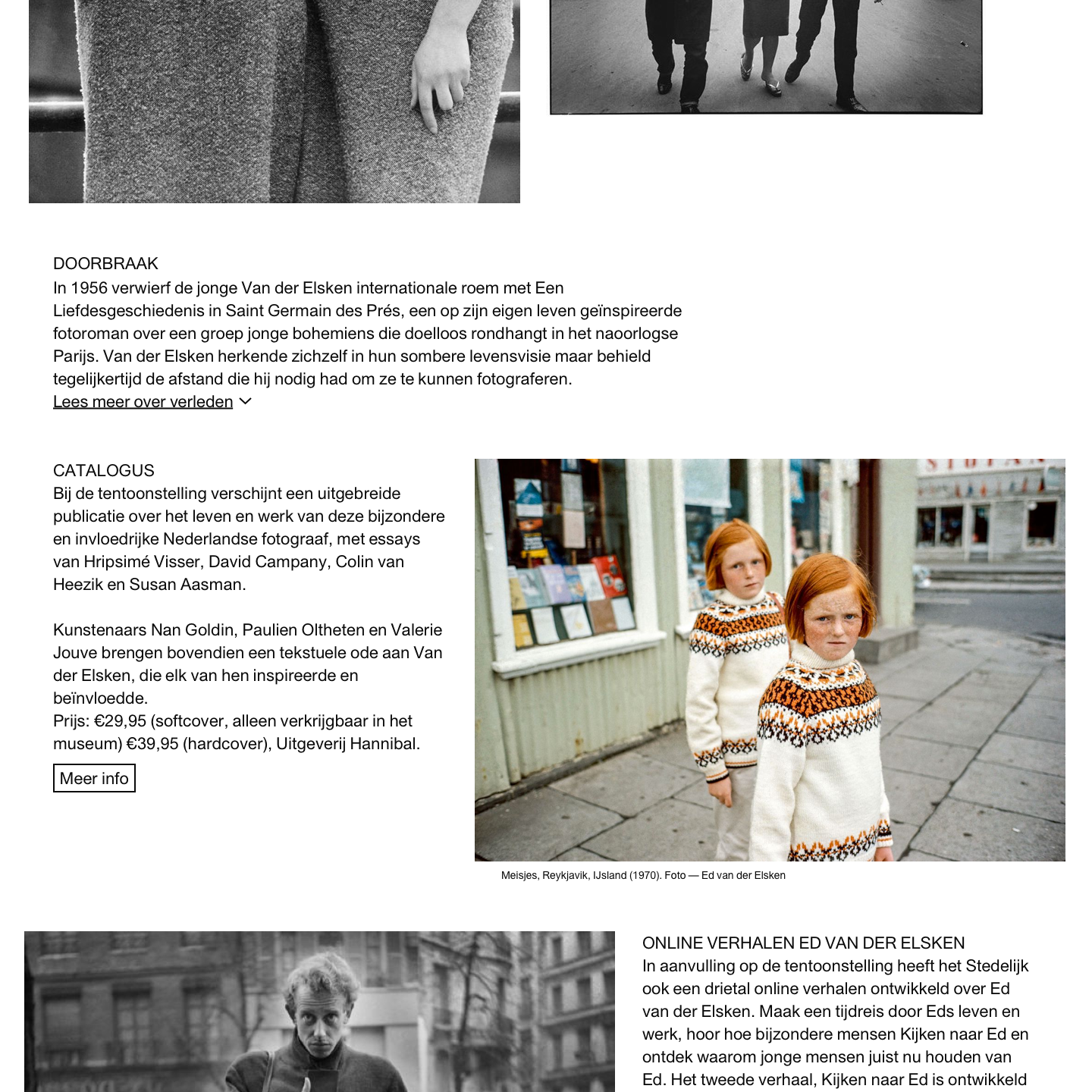
The website consists of different modules. Depending on the page template, modules can be added. For example, the exhibition page template should be inspirational and informative. The content manager can choose between a rich text or image module. Each module has many settings, making the page scalable. To ensure consistency, all pages end with typographic bars.
Bars behavior.
Header behavior.
Rich content behavior.
Image behavior.
Learnings
The Stedelijk website was a large and challenging project. There were many new things to learn. Creating a system for 15,000 pages was interesting.
The biggest lesson I learned is that no matter how many settings, templates, or buttons a client wants in the CMS, just keep it small ;)