Design should be fun.
Design should be fun.
— SpangaS website redesign
About SpangaS
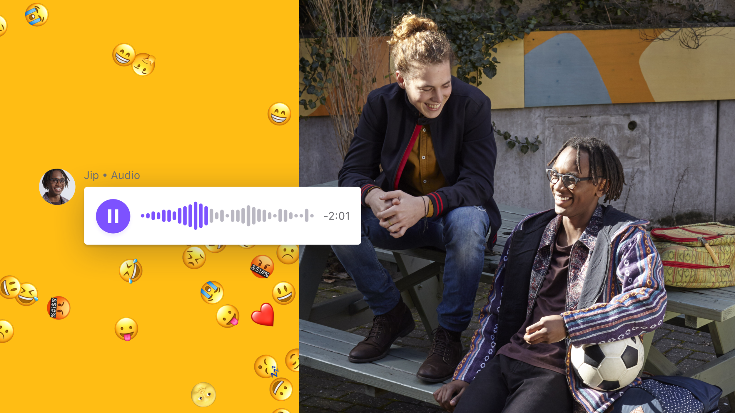
SpangaS is one of the most popular children's TV shows in The Netherlands. The television series revolves around the lives of a group of students at Spangalis College. They do an internship, help with the food bank, fall in love, argue, are insecure, come out of the closet, and try to make the best of it.
Characteristic of SpangaS is that taboo-breaking themes are discussable again and again. In recent years it was about homosexuality, suicide, quiet poverty, and dealing with cancer.
Can you create a website that is fun and suits the fans age and experience?

My role
Pitch
UX
Prototyping
User Testing
Visual
Brief
SpangaS is close to the experiences of children, also online like Instagram and YouTube. But these tech companies have proven to be unreliable in terms of privacy, and still, do little to protect children. The brief was to create a safe environment that is fun and suits the fans age and experience.
Pitch
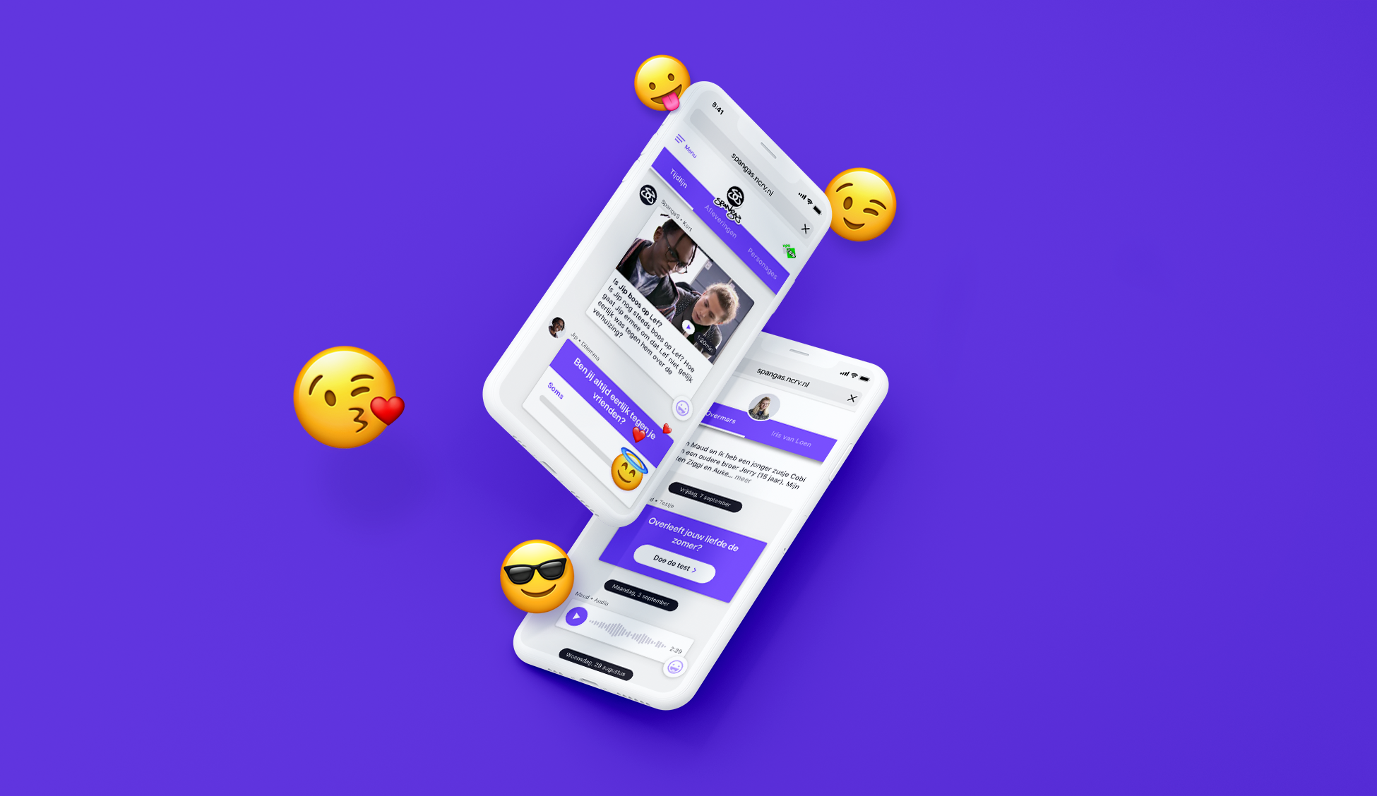
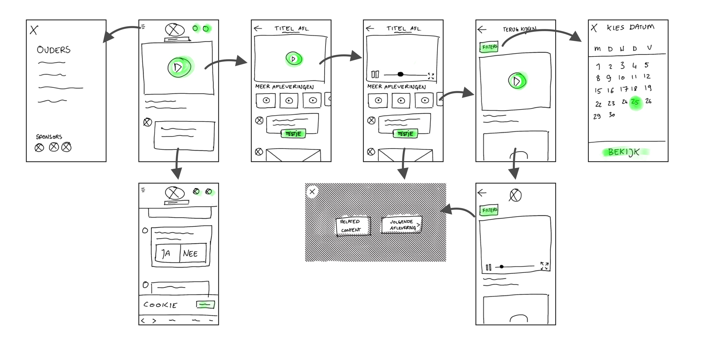
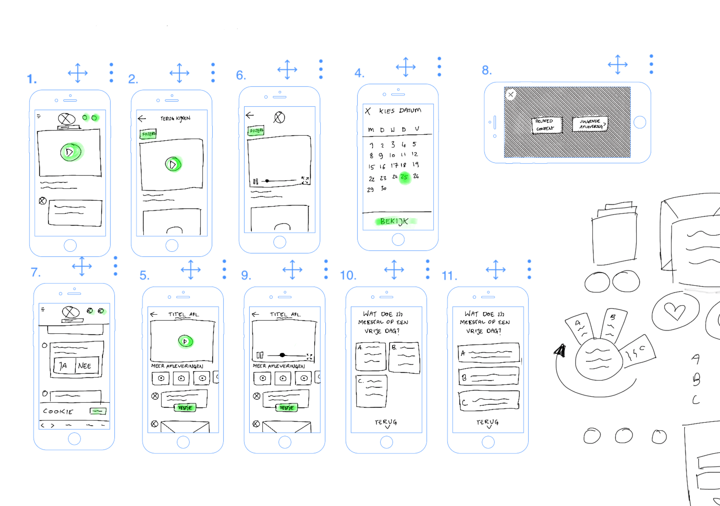
My role during the pitch was to create design and prototype. The prototype was meant to give a glance of how the website would look and feel. At KRO-NCRV, the content is essential; therefore, I wanted the design and prototype first focus on the content, and second to be playful.
I created the prototype in Principle; you can download it and try it yourself.
*Note: This prototype is created in Principle app and can be opened only with a Mac. (open the app by control-clicking the app icon and click “open”)
UX Design
Before starting with the wireframes, together with the whole team, we held workshops to find out who the user is, and how they use the website.
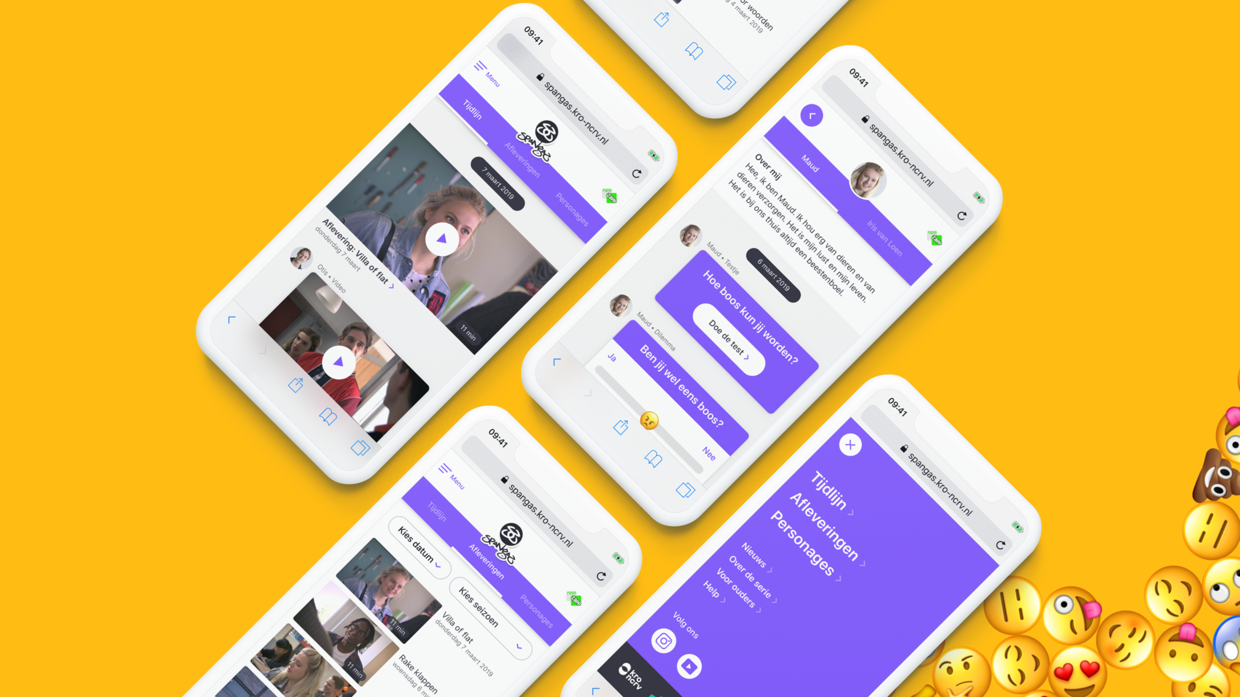
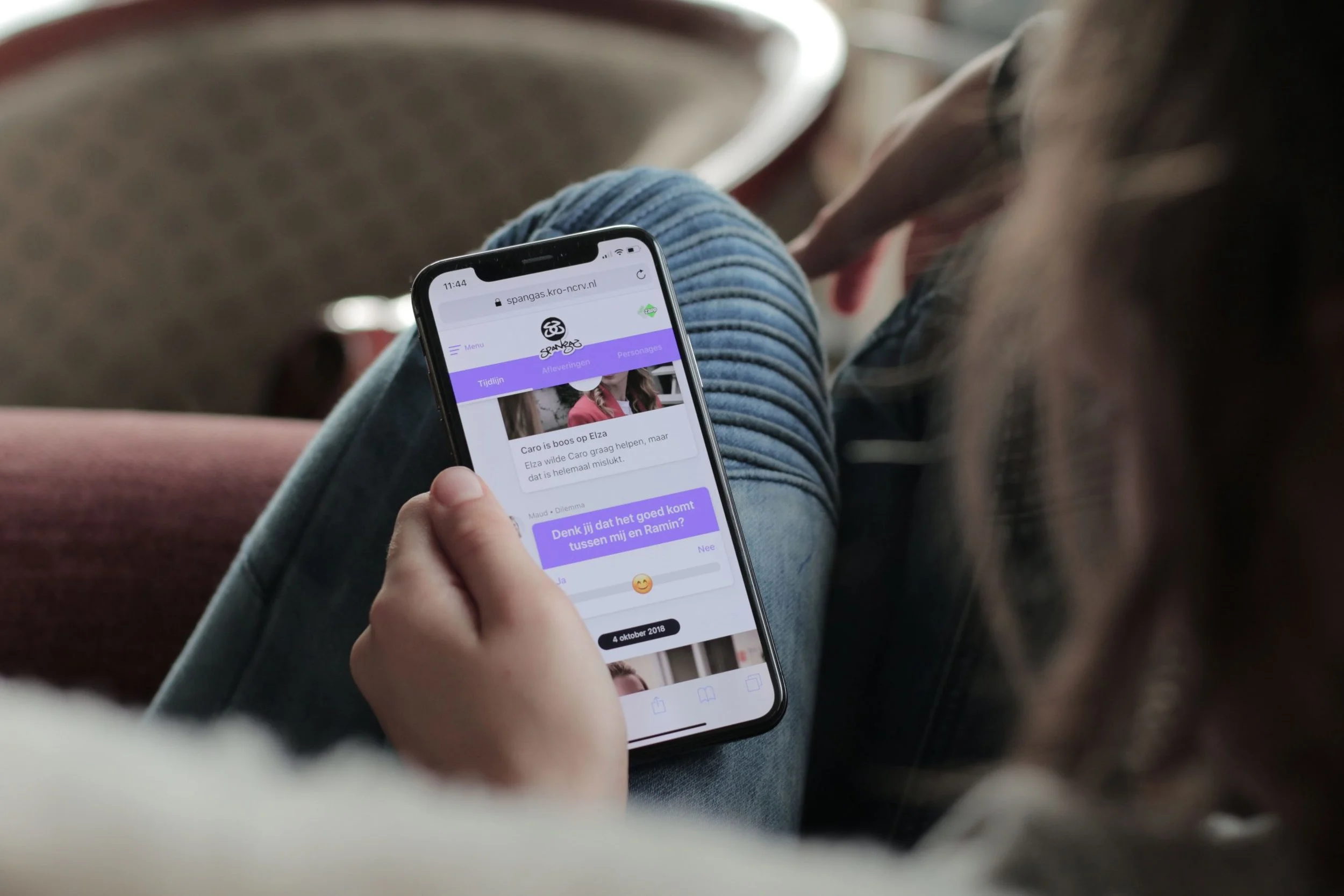
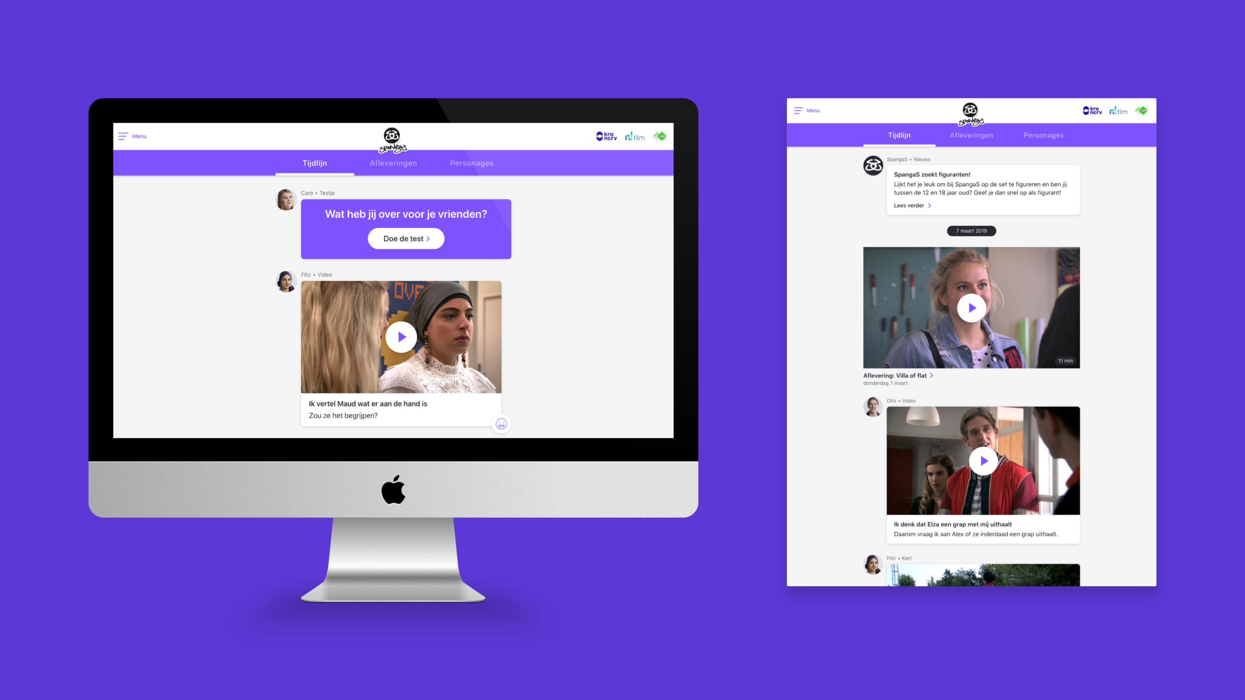
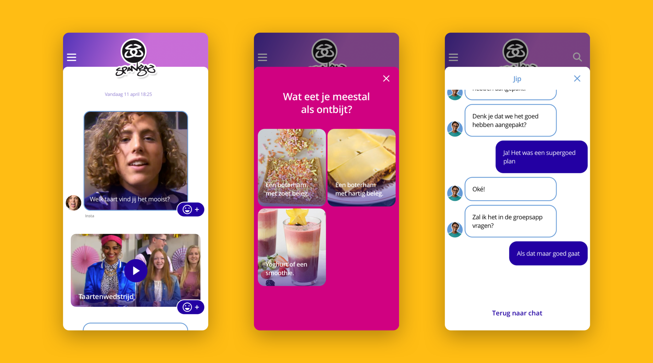
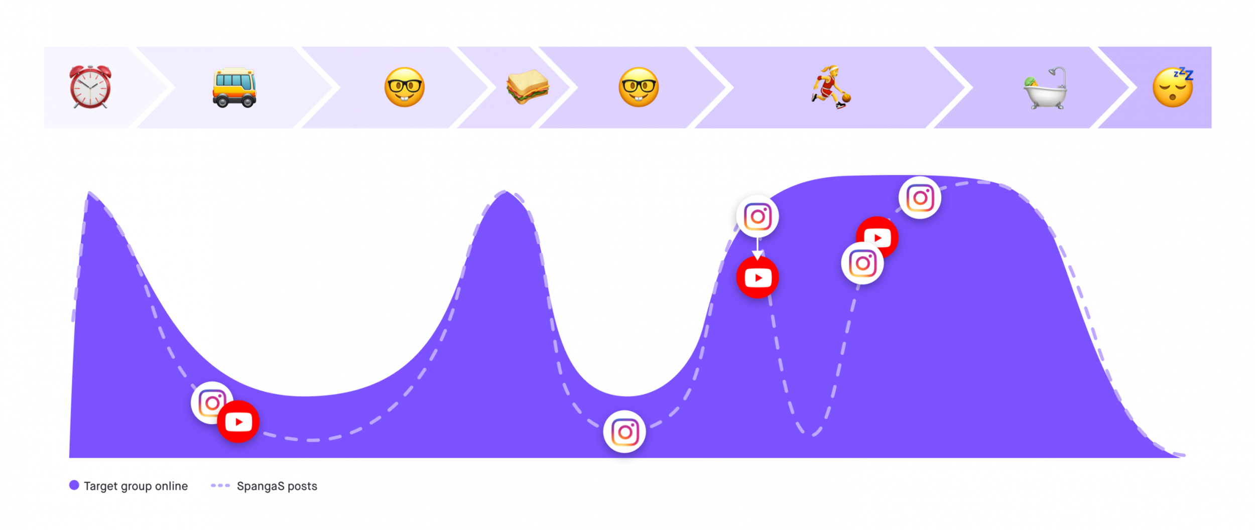
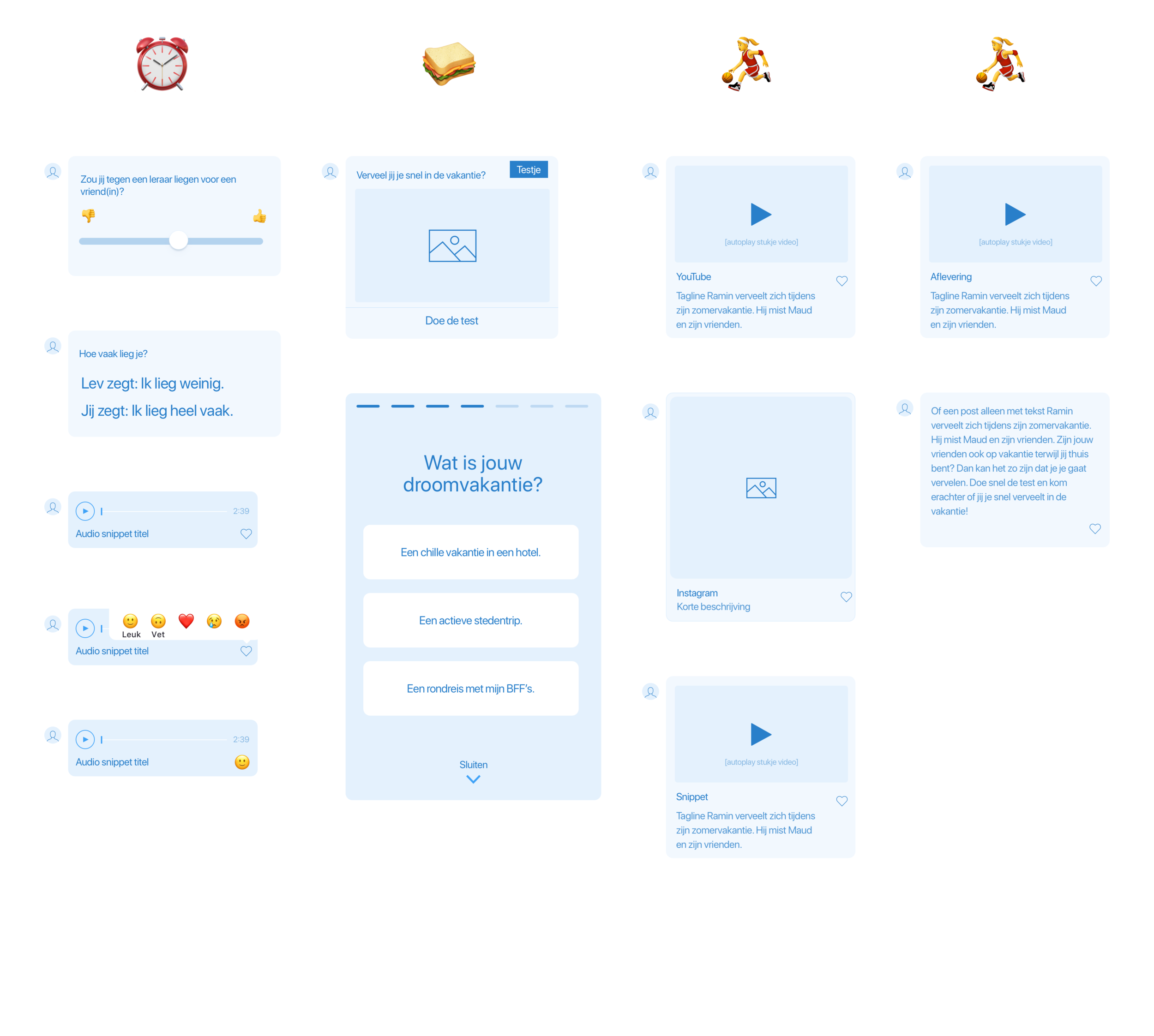
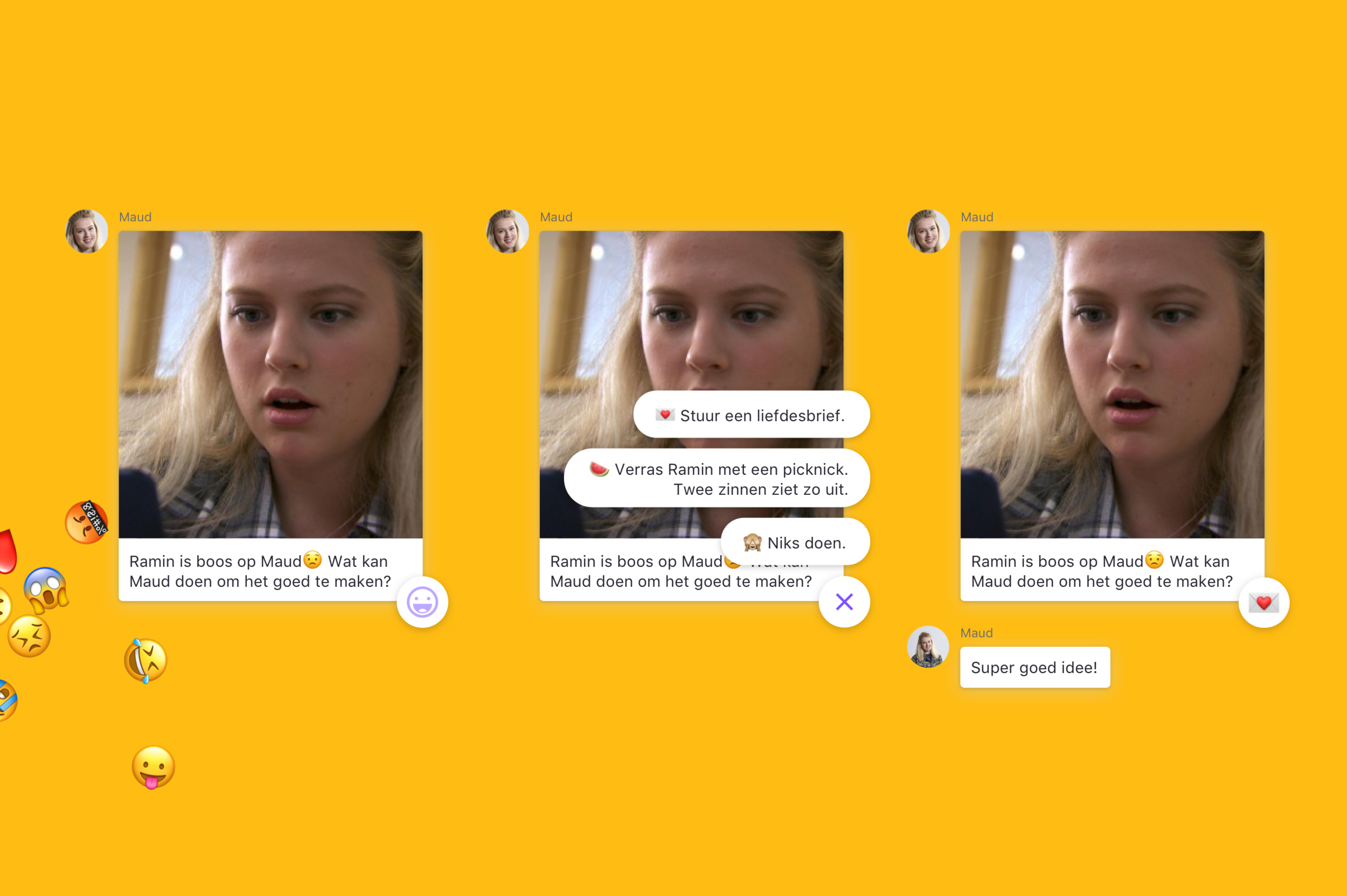
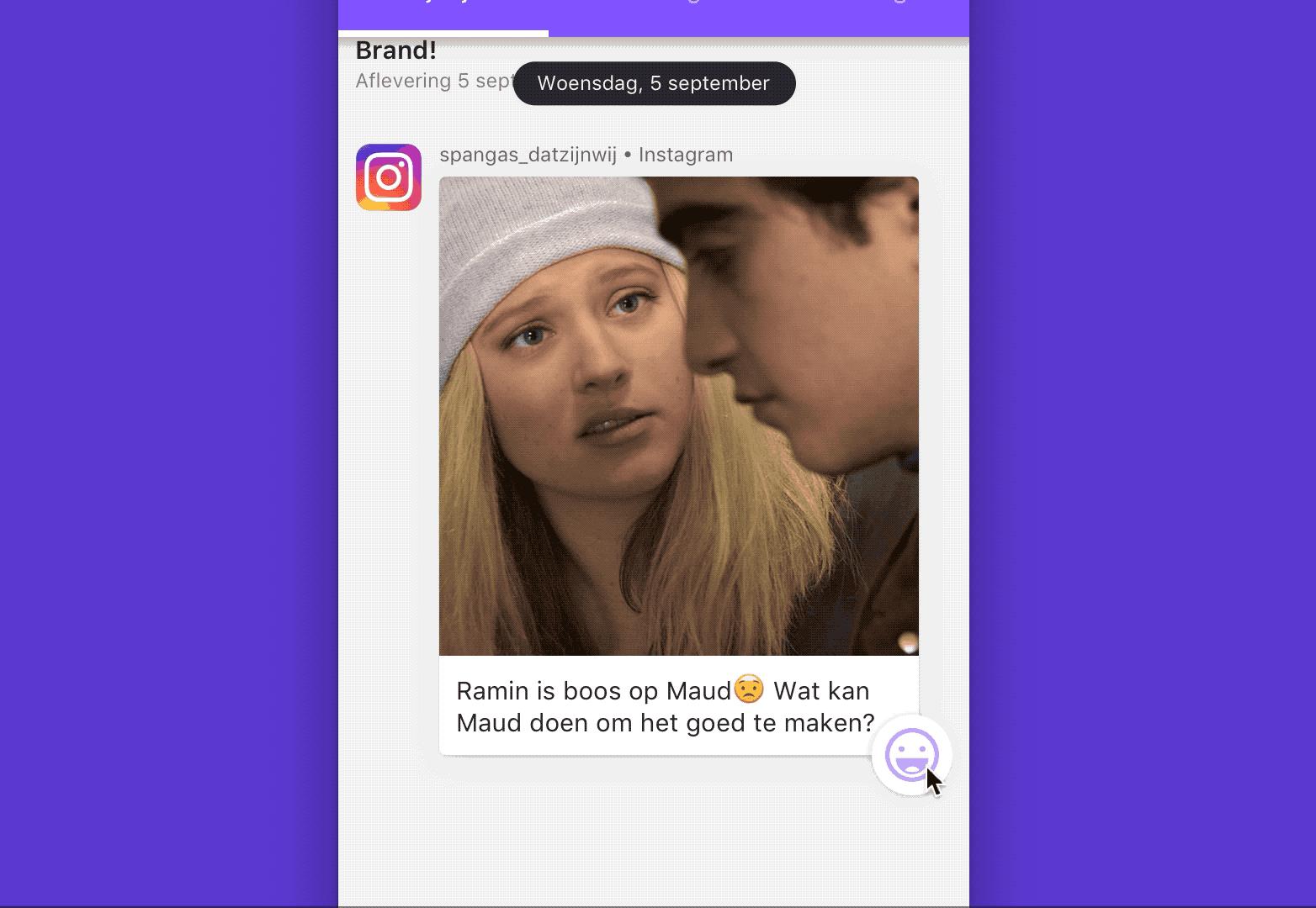
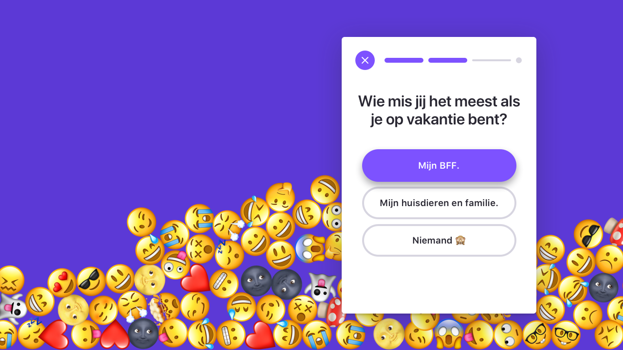
In the research, we saw that kids use the internet mainly on mobile, so of course, the new SpangaS site is mobile-first. We saw that the kids use their phone a lot in the morning, lunchtime and evening. Based on those three peaks, we created three different kinds of content. In the morning, kids are in a hurry, so you want to ask them a simple question or show update. During the lunchtime they are at school with friends, so you want to post a test that they can do together or a teaser for tonight's episode. And in the evening the episode is posted.
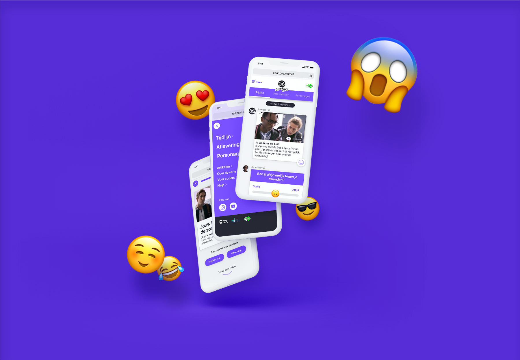
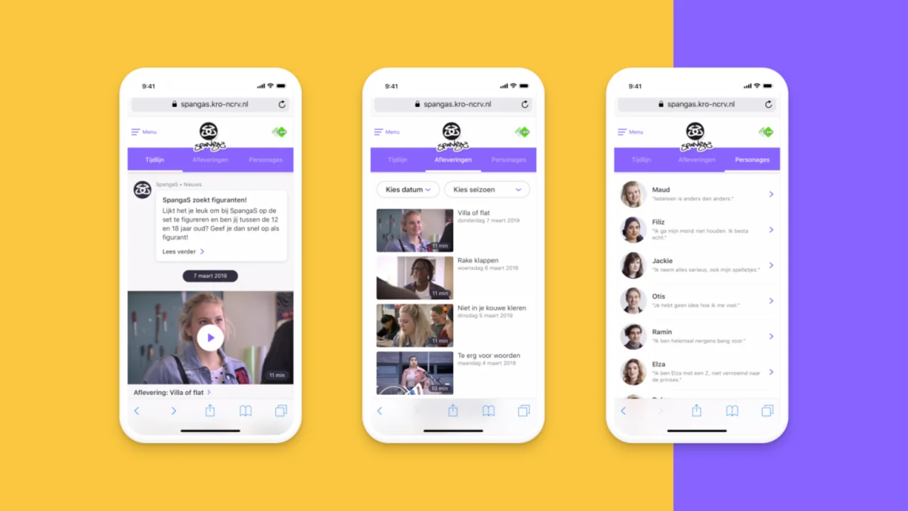
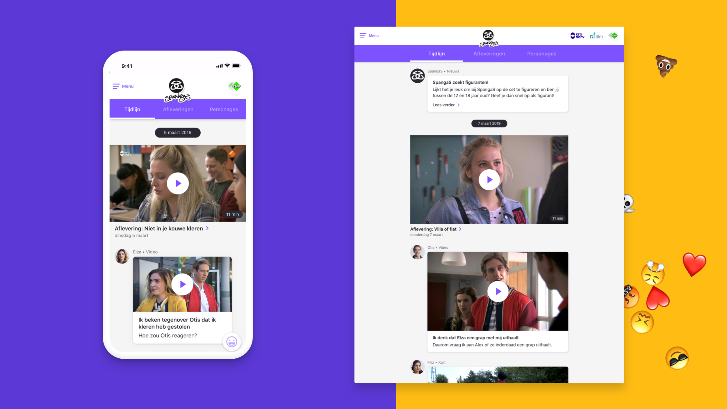
The interactive timeline is central: a place for all channels such as TV episodes, Instagram updates, and Youtube videos. Next, to the timeline, the users can find episode's, and for the big fans, there is a section about the characters.
The overall concept was to create a safe social media feed environment where SpangaS team can post messages and video's but then without the unreliable terms of privacy ;)
User test
After creating the first designs, we wanted to see how kids react to the redesign. The new design was so different from the original that it was significant to know how the fans will respond. The kids responded positively. Based on the test, we polished some features and were ready to build.
Design
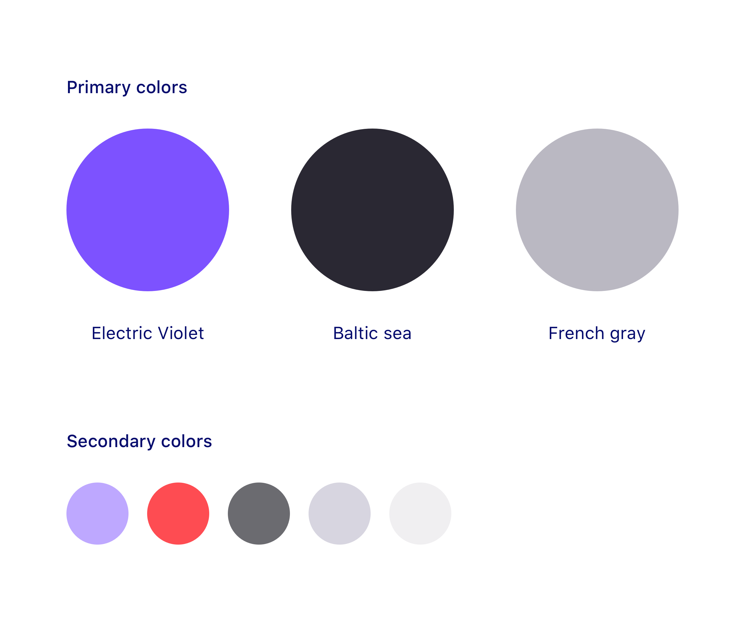
I wanted to create a simple design for the website. For the tint color (a color that suggests actions), I wanted a gender-neutral, fresh, young, and digital color. The public visiting the site are mainly girls, but the boys shouldn't feel excluded.
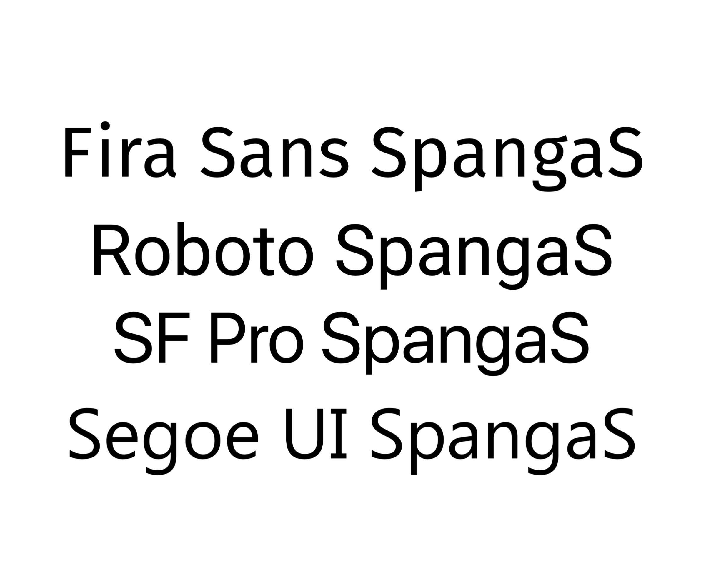
I wanted to give the website an app look and feel. Therefore I preferred to use the system font. The great thing about system fonts is that they're quick and we recognize them from apps.
Learnings
During this project, I liked working closely with the client. We often worked the whole days together designing from the content. This way, communication was smooth and fast. We could quickly switch and make quick decisions. I learned a lot about the pro's of a system font on websites and would advise it every one to use it as body text.